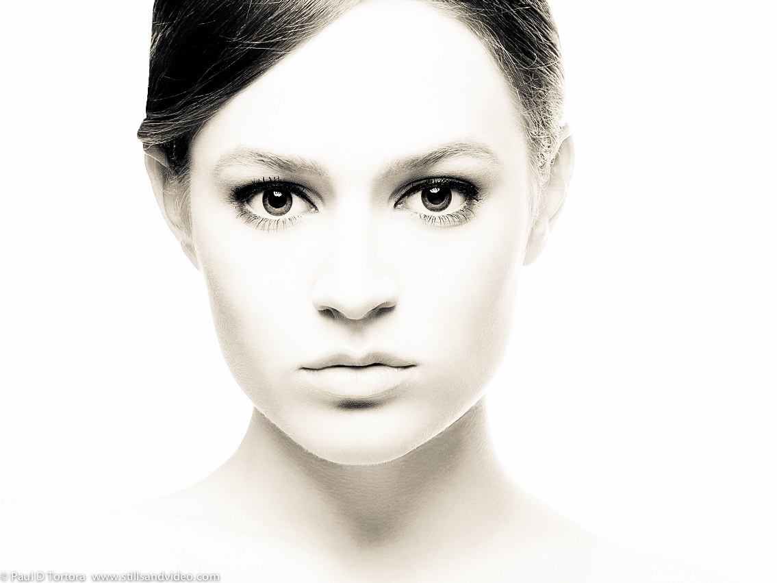
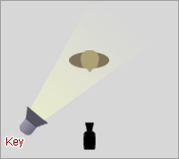
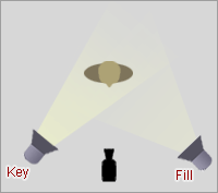
Key Lighting: The key lighting is the most important light a photographer/cameraman will use. It can be used to highlight the shape and depth of a subject and its omission may result in a silhouette. A High Key light image appears happy and bright, with a lack of contrast and shadows. Low key images are darker and are more contrasted - they often appear more dramatic.
Fill Lighting: Any source of light that removes areas of shadows created by other light. (Often used to remove shadows created by the key light). On its own it is not as bright but it is essential to dispel dark shadows that, although that may not have been that noticeable before hand, still darkened an image.
Back-lighting: The source of light used to illuminate a subject from behind which creates a glowing effect around the edges of the subject. It can also be called rim lighting, as it creates a rim of light around the subject. It completes the main trio of lighting and is often used in low key images to create a stark contrast and make and image look more dramatic.
This spotlighting is particularly effective in illuminating certain parts of the singer. It is efficient as part of an introduction as it keeps the allure of mystery around the singer, which is suitable for the genre. As this was one of the bands main singles, it is probable that this may be the first video potential new fands see, so it would be important to keep their attention through intrigue as the music progresses.
We are particularly interested in this scene as it has a similar lighting and setting to a scene we will be shooting. The key lighting really illuminates the singers face and the additional spotlights in the background help illuminate the setting and give the shot more depth.
The Pretty Reckless: Heaven Knows
We really liked this shot as it incorporates back-lighting and flares which we feel we would be able to easily recreate with a UV light. The spotlight in the background is very important in introducing the performer as the main figure and emphasizing star image so that the majority of the viewer's attention stays on her.
(Our Footage)
This was our first attempt at our performance scene. We now see that the lighting we used was too harsh and makes the video look slightly amateurish. In our final footage we will emulate The Pretty Reckless video by using a spotlight and back-lighting of a softer light. However, as want to conform to the conventions of metalcore, we do not want to use too much of a golden light as we believe it will not fit in with the song's lyrics.
Narrative
The Wonder Years: Cigarettes and Saints
This video was the central inspiration for our own. We loved the simplistic but effective performance shots and the successful use of back-lighting. However, we were also inspired by the outside scenes and the use of sun as a predominant light. Unfortunately, as their video was filmed in America, presumably during summer, their available light was much greater than ours will be in Britain in November.
We tried to combat this by filming at golden hour, which actually worked very effectively. We were able to capture some brilliant shots basked in a rich golden light and were even able to recreate a sun flare shot from the wonder years's (see above and beside). Now, our main issue is simply finding another clear day to film at golden hour for our final footage.
In this shot the lighting is consistent with the scenes before. We had an issue with this when filming our test footage as unfortunately, our golden hour did not last very long. There is very little we can do about this however so we will just have to film on a clear day and use additional filters and colour correction when editing to keep lighting consistent.
We did not use this editing on our practice footage as we wanted to see how much the lighting change would effect it. Although it was not very noticeable we do believe it made our footage more amateurish. Therefore, for our final footage we will place more emphasis on lighting to make sure it stays consistent and looks professional.
Our Lighting Choices
Performance
Filmed in the dark
Use street lamps to create a key light light
Use UV torches for spotlighting and to create back-light
Inside the house
In the bathroom: One lamp positioned above the actress, to her right (On a cupboard) and one positioned below the actress to her left (In shower area)
In the bedroom: Two lamps on either side of bed and maybe and additional on the dresser when she is getting made up.
Main lights - Not to be used in bathroom as will create too much of a glare but may be used in the bedroom if the lamps are too dim.
Soft Lighting - All the lighting we use will create a soft light which can then be manipulated later
Outside (Running Scenes)
Golden hour - To recreate the best lighting we need to use this to be able to film natural light flares and a soft glow.
Additional spotlights - We will take extra lighting as a precaution, in case golden hour fails us and we need to illuminate different parts of the character's face. However, this will just be for backup and not to be used as definite lighting.
We felt Anabel is perfect for this role, despite being quite young as she can easily make herself look older. Originally we were hoping to cast and older actress but we were unable to get hold of anyone who wasn't currently at uni. However, Anabel is very good at acting vulnerable and can perform in front of a camera with confidence so we believe she will be perfectly suitable for the role.
Main Boy: Joshua Broughall (Age 17)
Josh is also younger than the age we were hoping to cast but he knows Anabel well and due to the violent nature of some of our scenes we really needed someone who wouldn't feel awkward when he pretends to strangle Anabel. They both also live quite close so we will be able to film with ease knowing that they are both accessible if we over run.
Performer: Richard Skerratt (Age 18)
Richard is very confident and is ideal for this role as he won't be afraid to perform in front of the camera. He was easier to cast as well as he doesn't need to interact with the others and so does not need to know them. He also knows what is expected from him as he filmed his own media video last year and has a personal 'look' that suits the performer role he will be taking on.
We were somewhat unsure as to what we should incoporate in our promotional poster so we decided to look at similar band's original ones.
As you can see from this As I Lay Dying poster, iconic logo's and related photos were used to attract attention. However, the most important part of the poster is the text where you can see release dates, a link to a website for more information and other company endorsements. The text is simple and to the point, so that anyone reading it need not take up too much of their time or be put off.
In this asking alexandria promotional poster, there is very little text or information given as it is presumably not needed. The bands name, lbum title and release date is all that is needed to advertise the new product. The image used as a background is exactly the same as the new album's cover and the positioning of text also remains the same. This would be a very simplistic poster to emulate for our own design but we will probably add more text to make it slightly more interesting.
This Parkway Drive poster is also very simplistic but contains slightly more text, like the As I Lay dying one. It does appear less aggressive, perhaps due to slightly varying difference in genres, and personally, i would say it seems more attractive to a passersby as it is easy to look at. We will try to keep to simplistic colours in our own poster, to better suit genre conventions and personal taste.
We will be using a basic template like this to start our Digipak design off. This will be simplistic and easy to follow and will guarantee we get all the needed details.
In our initial survey that we sent out, too common suggestions to go with the title 'Disgusting' were blood and smashed glass. Whilst trying to find images related to these two ideas, we came across the picture of a smashed light bulb and thought we could easily manipulate something similar for our main photo and album front cover.
When researching more into this idea, we came across another photo of a smashed light bulb that we really wanted to emulate or use on our digipak. Unfortunately however, we need to create an entirely new photo for the cover to look unique, even if the photo and effects look exactly like we were beginning to picture and would have been easy to recreate.
We also realized that the image didn't really convey a feeling of disgust and so would appear out of place with the albums title. We then decided to incorporate the other popular connotation of 'disgusting', blood. As it stands, our digipak will now feature a smashed light bulb, with blood dripping down the sides and the band's logo. We will photograph the smashed, bloody light bulb and then enhance it on Photoshop to get the most professional look we can manage.
More inspiration - our photo will look similar to this
We looked at several digipak examples of a similar genre to draw inspiration for our own. We want our digipak to conform to expectations so that it looks realistic but still unique
This digipak by Mallory Knox is quite simplistic, the front cover just pictures the bands logo (The signatures are not part of the original design) which makes it iconic and attractive to former fans. The back cover is also simplistic, with the titles of songs in a simple white font against a juxtaposing black background. This style is quite popular as it understates the content of the album and has fans focus on the CD and music itself. The lyric booklet is also understated but the colourful addition of the lead singers photo against a blue and pick background personalises the album to keep it from being too neutral and lightens the overall theme.
This album cover is busier than Mallory Knox's with more detail and thought given to the overall effect of the digpak. Personally, i do not actually like this as much because it appears too busy with too much to look at. I do like how the front and back cover are similar, with related photos but i do not like how similar photos ar also used in the inside of the CD case. It may be because the digipak is larger than Knox's that they felt the need to add more detail, which is also conveyed in the lyric booklet with photos of the band to enhance star image.
Out of the digipaks we studied this was probably my favourite. I really like the simple, understated effect it creates and that their logo is the main focus. I also like how the same intricate pattern is used throughout, creating a sense of continuity. The muted colours also emphasize the metal-core genre but contrast enough for it to stand out. There is also less focus on star image, trying to inspire a sense of unity in the band as you are meant to enjoy their music and the digipak as a whole.
You Me At Six is a younger rock band so there is more focus on their group's star image. This is conveyed by the multiple group photos included in the digipak, to encourage their younger target audience to buy it. This personalizes the album cover as it appears to be like a direct gift from the band. Despite the photos, the rest of the digipak does conform to the colour neutral and simplistic styles of the other album covers which leads us to believe this is the best path to go down on our own design. It also means we will be able to create a simple design, which should be easier and make it look more professional.
Due to two of our actors being under 18 we felt it necessary to have them sign a release form, proving that they agreed to act in our video. This was also provoked by the violent nature of some of our scenes and the reference to drug taking and a potential suicide attempt. Both our actors were made aware of this content before they signed the forms.